Pleasanton Ranch
Responsive Web Design
This page serves as a case study for a Responsive Web Design for a client wanting to conceptualize how they can best utilize their property. Primary tools used: HTML5, CSS, JavaScript, JQuery, Photoshop, Adobe Express, Adobe XD, Miro.
View Live ProductWHAT'S THE PROBLEM?
THE PROBLEM
A landowner with a vision for their undeveloped property dreams of creating a welcoming compound that offers guests an unforgettable stay in themed, thoughtfully designed dwellings. However, they face the challenge of translating this vision into a cohesive experience that not only captivates but also simplifies booking for potential short-term renters.
THE SOLUTION
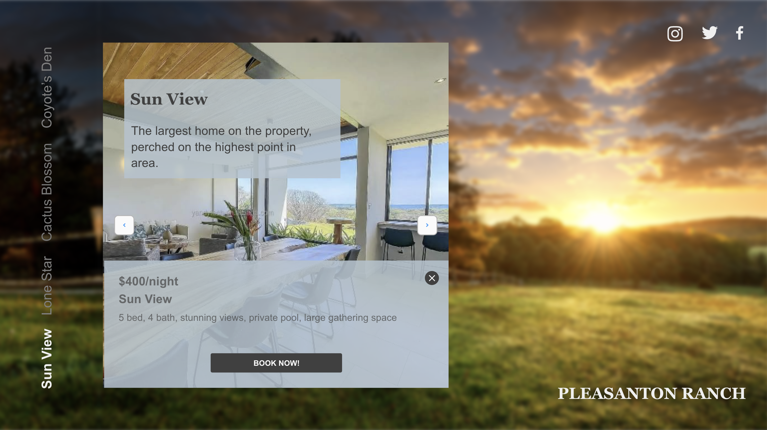
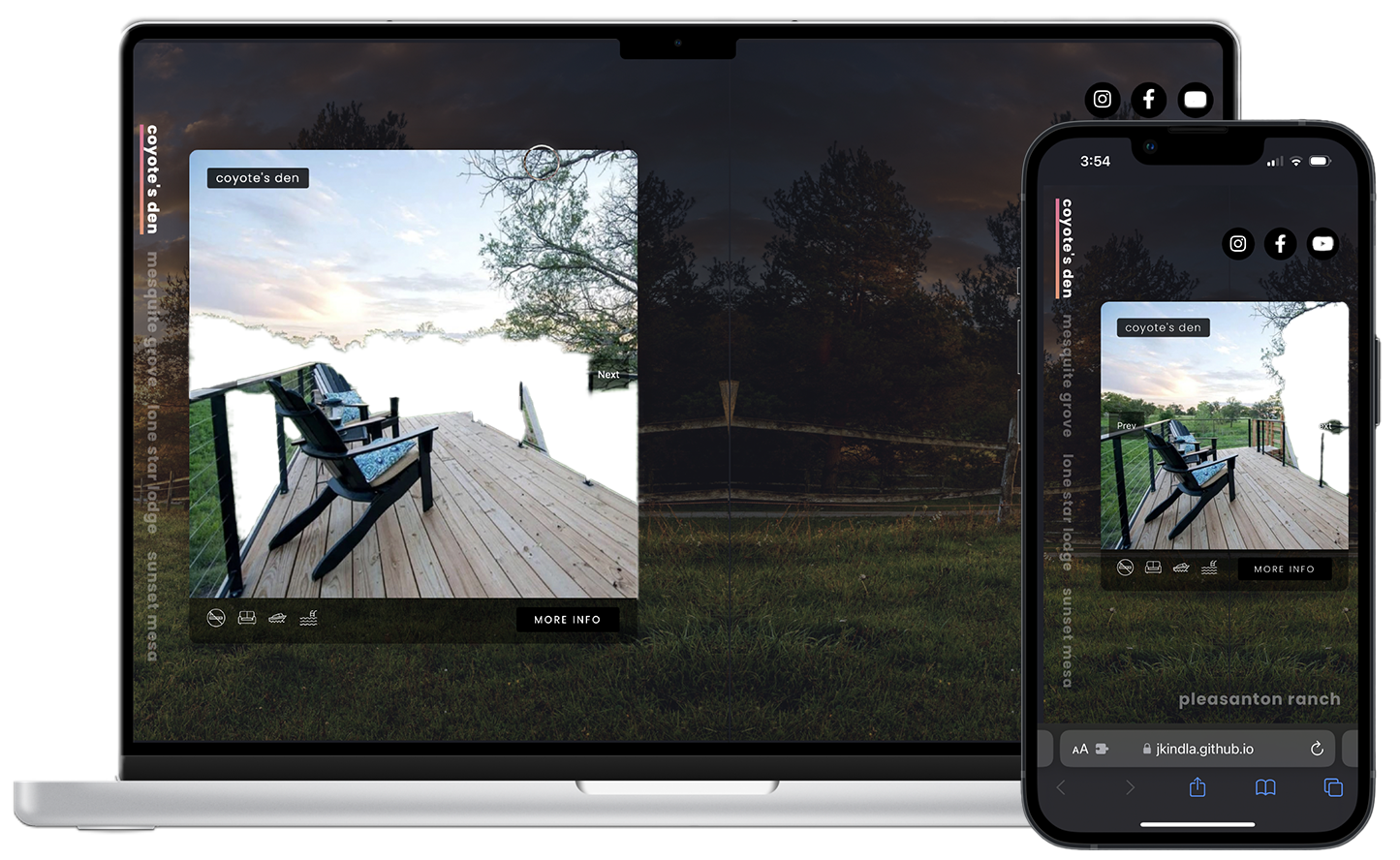
I developed a custom webpage for the compound that highlights each dwelling with unique themes and branded names, enhancing the property’s appeal to short-term renters. The site offers an intuitive layout, visually rich content, and easy navigation, integrating seamlessly with booking platforms like Airbnb to streamline guest reservations.
RESEARCH
User Interviews & Testing
User testing and research were conducted to ensure that the design and functionality genuinely meet users’ needs. By interacting directly with users, I gathered insights into their preferences and pain points, allowing me to validate design choices, make data-driven improvements, and ultimately deliver a solution that is both intuitive and effective.
View Data Competitor Analysis
Competitor analysis was conducted to understand the strengths and weaknesses of similar products in the market. By examining competitor offerings, I identified key opportunities to differentiate the solution, improve usability, and address gaps in user needs. This analysis helped me position our product more effectively and ensure it offers unique value.
View Data Storyboard
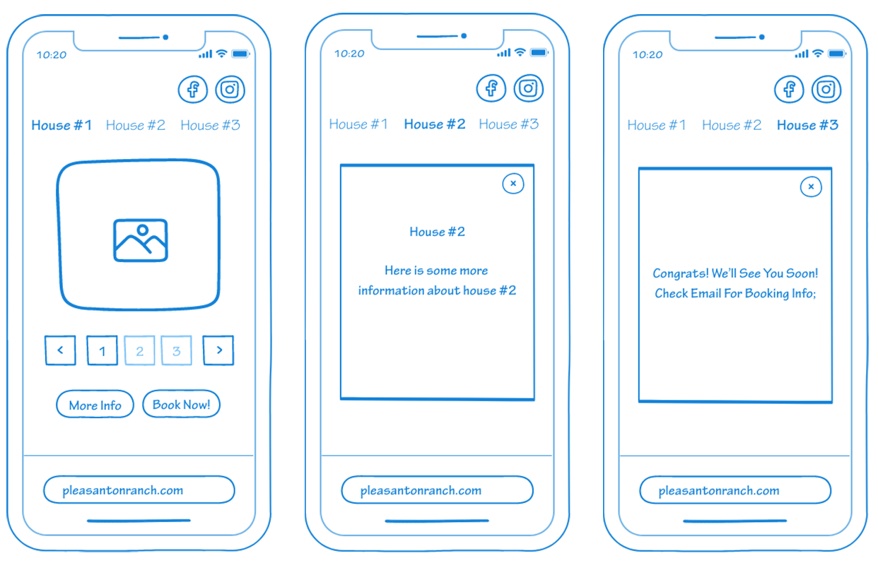
The storyboard was developed to visually map out the user journey and ensure each step aligns with user goals and expectations. This helped me anticipate user interactions, streamline the flow, and create a cohesive experience from start to finish.
View Data


