ALKALINE WATER SATX

Homepage Redesign (UX/UI + Front-End)

A modernized redesign focused on clarity, credibility, and conversion-friendly calls-to-action — shipped as a working build.

OVERVIEW

  • Goal
  • Improve scannability, strengthen trust, and make the primary actions obvious (contact / learn / order) — especially on mobile.

What I noticed

The original site had good intent, but key info was competing for attention. The hierarchy made it harder for users to quickly understand the offer and take action.

  • Deliverable
  • A working redesign with cleaner structure, clearer messaging, stronger CTA placement, and improved layout rhythm.

What I shipped

A modern homepage redesign built with lightweight front-end code. The layout prioritizes clarity and credibility while keeping a clean, local brand feel.

BEFORE / AFTER

Quick comparison: original site vs redesigned homepage.
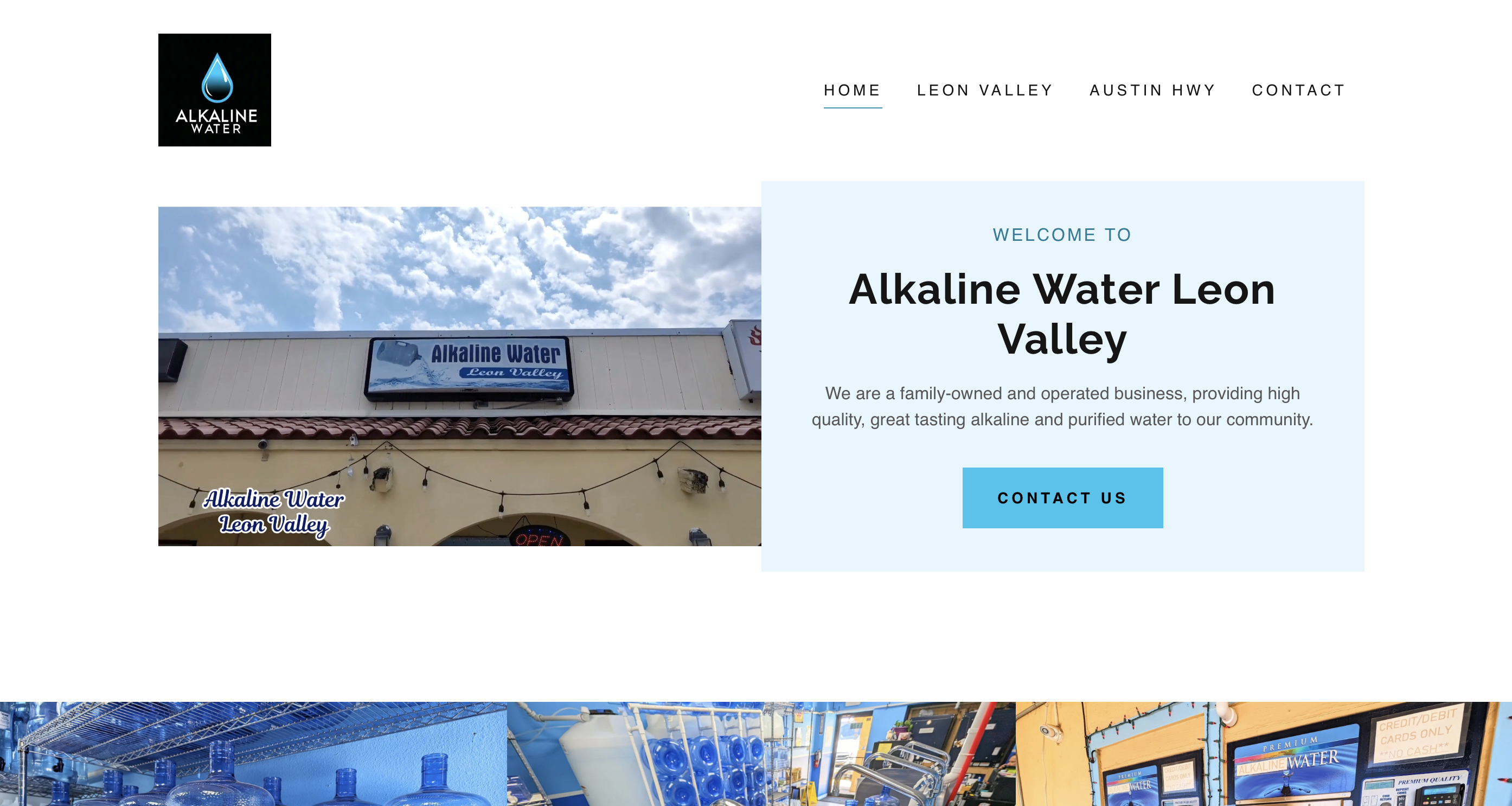
Original

Reference point for structure + messaging.
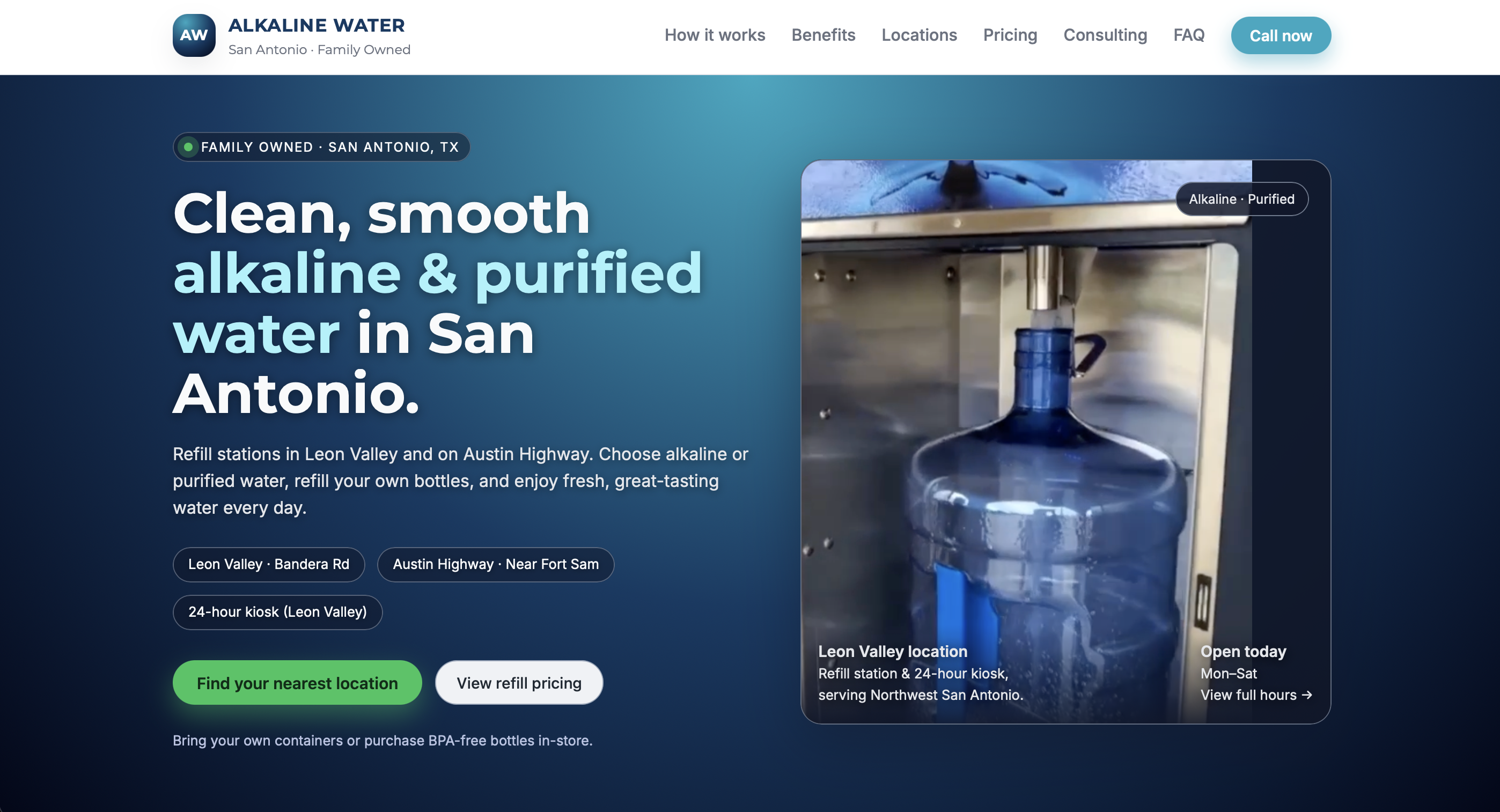
Redesign

Improved hierarchy, CTA clarity, and mobile-first layout.

REDESIGN BREAKDOWN

This was an implementation-first redesign (no formal research artifacts). The goal was shipping practical UX improvements that make the site feel clearer and more trustworthy.

Information hierarchy

Reordered content so users can quickly understand the offer and what to do next.

CTA clarity

Consistent, obvious actions with better visual priority and placement.

Mobile-first layout

Improved spacing, readability, and tap targets for a smoother phone experience.

Trust + credibility

Surfaced trust cues earlier to reduce hesitation and support decision making.

SEO-minded structure

Cleaner headings and content blocks that support scanning + semantic structure.